Kiwibank is one of the largest, New Zealand owned banks in the country, and providing a seamless mobile banking app is core to user’s everyday banking experience.
UX, UI, User Research, IOS, ANDROID
1. Brief
Kiwibank is the only New Zealand owned bank, which proudly plays into their branding strategy: “Kiwis making Kiwis better off”.
It is the only bank whose branches are merged with the post office, thus making every New Zealand post shop a Kiwibank branch. However, with the growth of technology, users were moving away from day-to-day banking at branches to the internet and mobile banking.
Kiwibank engaged us to re-design and re-build their current core mobile banking application, as the original app was built on a hybrid platform.
The brief was to rebuild the app on a native platform for each OS to leverage the capabilities of each OS, maximising the performance of the app.
Transactions & Goals
What's new box informs returning users that a new feature has been released
Keep Safe and Payments
Messaging for enquiries
Pre-login & Menu
2. My Role: Lead Designer
Developed product strategy and feature prioritisation.
UX/UI design (managing another mid-level designer in my team).
Ongoing design support during development.
Our project team was co-located within Kiwibank, with their existing mobile team, for 9 months until project launch.
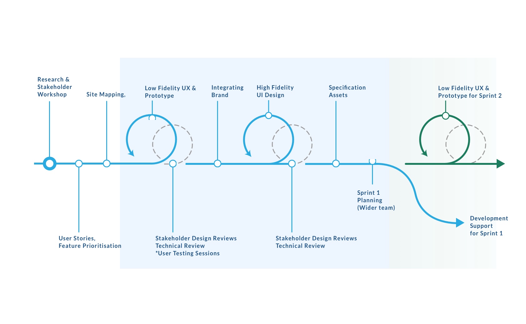
3. Design Process Overview
What is our design process?
We stay one sprint ahead of the rest of the product team so that we would have the designs in the current sprint finalised before development begins. While developers worked on Sprint 1, designers moved ahead into working on features from Sprint 2.
The design process varies from project to and has to adapt to the product build.
4. Stakeholder workshop series
Part 1. Background
Project background summary, clients described how we got to this point.
Part 2. Understand
Walkthrough existing mobile app, and go through feedback from different channels eg: app store review, direct email form, social media, help centre (phone calls), also run through existing persona groups.
Part 3. Feature Backlogging
Blue sky thinking. Identifying features.
Part 4. Prioritise based on analytics
Analytics collected from they existing app provided us with a roadmap on prioritisation of the features.
Part 5. Grouping and weighing effort
High-level features are weighed by all participating team leads and grouped, prioritised with consideration by the product manager. Then grouped features were weighted with an effort score.
Initial feature backlog.
5. Design Goals & Challenges
Key challenges
The app build roadmap had to follow the existing app, feature-for-feature.
While user experience and interface can be enhanced, no changes could be made to APIs during phase one.
The uncertainty of future roadmap, lacking prioritisation of future features.
Multiple business stakeholders, often difficult to aggregate input.
Multiple sources of feedback, requiring sorting, grouping and prioritising.
Integrating our design team into the wider client mobile banking team.
Design goals
Phase One, to re-launch the Kiwibank mobile banking app, rebuilt on native IOS and Android platforms.
Must maintain consistency with Internet banking online
Refresh the visual design while continuing to align with the existing Kiwibank branding and marketing guideline.
Built with a navigation framework that will allow the extension of features in the future.
Ability to re-skin apps for sub-banking organisations with minimal design/development efforts.
Understand feedback from multiple channels, in order to guide the design thinking (eg: analytics, feedback, customer service desk).
Keep the stakeholders involved and engaged during the design process.
6. User Journey & Site Mapping
Mapping out user journey
Using existing app screens, we mapped out user flows to provide us with guidance on the proposed designs The existing app provided a benchmark of experience for us to improve on.
Why Site Map?
Site mapping is the first attempt at brainstorming the information architecture. It is used to capture functionalities, interfaces, navigation hierarchy & content type and gain a quick overview of the entire application without diving into sketches or wireframes at the early stage.
Constantly refer back to existing user journey for business logic and existing user flows to look for ways to improve upon it.
Proposed sitemap information architecture.
7. Iterative Process
1. Hand sketch to prototype
2. Wireframes to prototype
3. Interaction prototype
4. UI prototyping
5. Implementation in product
8. Decisions and Considerations
Navigation: Side Drawer vs Tab Bar
The navigation needs to extend to incorporate these in the future as there was uncertainty with features roadmap and using side drawer will accommodate for growth of uncertainty.
With banking features, we’ve identified that users are more engaged with individual features rather than jumping between or multi-tasking.
Navigation pattern is the same whether the user is logged in or using pre-login features.
Initial user testing identified that they are familiar with the burger icon.
9. Design Review & Internal Demos
Design Review
Example of presenting design concepts and opening the floor to discussion stakeholders.
When: Once per sprint.
Who: Stakeholders from relevant teams (Kiwibank), Design team.
Why: Scope out specific business logic from department specific stakeholders. Eg: Credit card representation, Customer service representation. Put wider team at ease that their opinions won’t be ignored. Discuss conflicting ideas from different departments in an open forum to ensure that they were resolved.
Internal Demos
More tech demo, but design is represented.
When: Once per sprint. (last Friday of sprint)
Who: Sush Team, Internet Banking Team, Mobile Banking Team, Internal tool team.
Why: All three digital channel teams present what has been done in the last sprint. It's a good way to engage and align with other digital teams to discuss upcoming features on the next sprint and and cross impact.
10. Brand Integration
Working with an existing enterprise brand
Logo is simple and pretty robust. It is always green and square. Challenging to scale for navigation bar and side draw accordingly.
Kiwibank’s tone of voice is and has a great sense of humour.
Imagery needs to shows the Kiwi spirit in all its colour, passion and intensity by using imagery that no other bank could lay claim to.
Grass background was taken by our team from a patch of grass outside the office. Approved by client marketing : )
11. Implementing UI style
UX to UI?
Consider how styling will be applied in context of Internet banking to provide an integrated and consistent experience.
Font weights used to identify visual heriachy.
Background image contrasts well with the UI, while still staying on brand
The navigation bar title font remains as Meta Serif which is a key Kiwibank brand attribute.
Flat graphic used to align with existing graphics from the brand key guidelines.
UI consistency between Pre-login and post-login is important to reduce learning curve for users.
12. User-testing & Scenarios
Summary
For selected sprints, we conduct user testing with real banking customers. Typically Participants met with the designers & business analyst for 15 minutes and completed eight tasks relevant to the state of the mobile app prototypes. Before each session they were asked to fill out a questionnaire about their profile and mobile usage.
Usually between 6 - 12 participants, having the various characteristics, is asked to evaluate the Kiwibank App & prototypes
Scenario
Using your “Free Up – 00” account, you want to pay your friend Ben Gordon for books he bought for you. How would you proceed?
Outcome
4 participants completed the task with ease (score of “2”) making a payment to Ben Gordon.
2 participants needed prompting or had significant difficult completing the task (score of “1”)
0 participants did not complete the task (score of “0”).
Allowing users to make a payment within their “Account Transaction” screen and pre-populating the “From” field with that account could make for a more intuitive experience.
13. Sprint Based Delivery
What do we deliver per sprint
Specifications
Assets
Acceptance Criteria
UI Prototype (Flinto / Marvel)
Interaction Prototype (Principle for Mac)
In last year, we have moved into Zeplin.io for better digital collaboration.
There isn’t any replacement for walking through designs & discussing implementation face-to-face with developers, hence why co-location with the client was so crucial to product development.
Specifications act as the blueprints that outline the colour, components and typography styles used in the application.
Annotation of dimensions and notes explaining layout and responsive constraints, and any other non-functional requirements.
14. Feedback & Future Phase
Feedback after pilot re-launch.
Very well received by users
Liked comments: Speed and Performance, Clearer layout, Modern look and fit, Pay & Transfer improvements, Love the grass background
Need improvements: Missing functionalities like Goals, Touch ID, Cancel, Lock Card, Need to be obvious with notes about fees.
Ranked top in Usability for NZ mobile banking app in 2017 by Forrester, ahead of competitor banks: ASB and BNZ - http://bit.ly/2sEKeRw
What’s new banners driven from API, and funky new release notes to match Kiwibank’s tone of voice.
Explore digital on-boarding using facial recognition
Started off as just R&D between IOS dev and the design guys. We deployed the Kiwibank apple watch app about three month post re-launch of the mobile app.
13. Retrospective
Obstacles & Issues
Remote collaboration with the mobile team was tricky at times. Sometimes specifications and prototypes aren't enough, the solution might be just a quick discussion or a review of the coded UI with the developer.
Brief requires the team to redesign app "feature-for-feature", no room to innovate.
Unable to implement improvements that require API changes.
No dedicated UX research resource.
No dedicated UI Prototyper. (It would have good to have a mobile UI developer work on proof of concept at the design phase, using data etc.
What would I have done differently?
• Would have like to explore tab bar navigation. If we could scope out the roadmap more thoroughly before we began, we could have justified how tab bar could work equally as well, if not better
• Prioritise innovate features to push into MVP eg: Personal Banking Analytics, transaction sorting, social payment, customisable notifications, Cardless ATM interfacing
• Work with their marketing team and experiment with symbols / graphical assets further.
• Push for mobile design to influence the overall Kiwibank Branding Guidelines, as digital strategy moves more and more into mobile.
• Regularly schedule user testing sessions, rather than ad-hoc (when resources are available).
• Put more emphasis on tablet view to be more unique.